Y-Axis Zero Align
The Y-axis zero alignment feature in Power BI forces the starting point of the Y-axis to be set to zero. This feature is crucial for axis-type charts such as column charts, line charts, and area charts, as it ensures consistent and accurate data visualization.
Why Use the Zero Align?
- Data Consistency: Zero alignment ensures that data is displayed starting from zero, avoiding misleading visualizations caused by varying starting points.
- Visual Effect: A uniform starting point helps viewers compare different data points more intuitively.
- Data Accuracy: It prevents misunderstandings caused by non-zero starting points, ensuring the data display accurately reflects the actual situation.
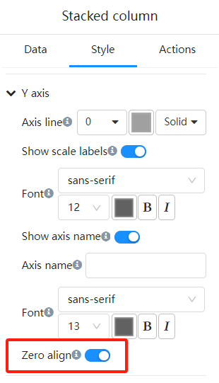
Enabling the Y-Axis Zero
In the "Format" panel, expand the "Y-Axis" options.
Find the "Zero align" toggle.
Examples
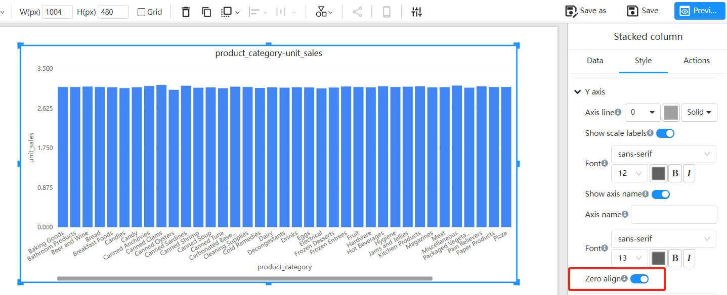
Zero Align On
Y-Axis minimum value: 0
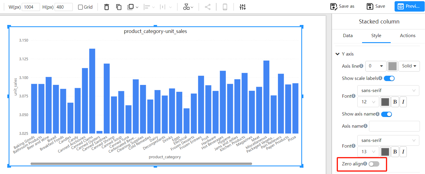
Zero Align Off
Y-Axis minimum value is automatically calculated based on the data range.
Frequently Asked Questions
Q1: Why does my chart look the same after enabling zero align?
A1: If there are no significant changes in the chart data itself, the visual effect may not be noticeable after enabling zero alignment.
Q2: Can I set zero align for both the X-axis and Y-axis?
A2: Zero alignment is typically applied to the Y-axis. However, for some charts like scatter plots, the X-axis start value can also be set to zero.